Kimya Gandhi
by Manica Pathak
Mumbai-born type designer Kimya Gandhi redefines Indian typography by reimagining the Devanagari script through innovative, culturally rooted typefaces that bridge local visual traditions with global design sensibilities.
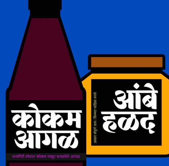
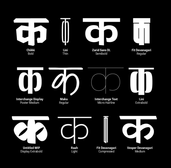
Mumbai-born type designer Kimya Gandhi is one of the well-known voices in Indian typography, reimagining the Devanagari script with a wide range of innovative typefaces. What stands out in her work are Hindi letters taking on multiple forms–from geometric and wide horizontals, delicate thin verticals, to futuristic brush-like strokes. In today’s global design ecosystem, Kimya is pushing the boundaries of Indian vernacular typography, bringing it into the same design flexibility that Latin typefaces have possessed for decades. A graduate with a Bachelor’s degree in Design and Communication from the National Institute of Fashion Technology, she found herself drawn to letterforms and typography at a time during her course when type design in the country was not yet in the spotlight and its scope was still relatively unexplored. This growing interest led Kimya to pursue a Master’s at IDC, IIT Bombay, followed by an internship with Linotype in Germany, where she worked on DIN Next Devanagari alongside the legendary Akira Kobayashi. It was followed by a summer at the University of Reading’s Typeface Design Intensive (TDi) program, where she deepened her understanding of scripts and their cultural nuances. Today, her practice has evolved into running the Berlin-based type foundry Mota Italic with her partner, Rob Keller. Established in 2008, the studio is known for its extensive multilingual fonts, and Kimya has brought the richness of Devanagari into this mix, expanding the foundry’s reach across scripts that span both Latin and Indic traditions. This unique perspective on viewing Devanagari fonts has attracted global clients, including Škoda, Porsche, Audi, BMW, and Google. While Kimya’s formal journey may have taken her across continents to shape her technical foundation, the core of her work draws from a more personal space. Her inspiration stems from the everyday visuals she grew up with in India—hand-painted theatre posters, street signs, and the hand-lettered boards outside local shops that once defined the visual texture of the streets. As she creates a space for these influences in her practice, Kimya’s journey points to an emerging pattern in which Indian designers are drawing on culturally rooted references and asserting their significance beyond borders. Her role in shaping design goes beyond her own works and has become an active voice in the global type design conversation. From conducting workshops at international platforms like TypeCon in Washington, DC, to mentoring young designers at India’s leading institutes, including NID, Pearl Academy, and NIFT, she continues to expand the reach and relevance of Indic typography worldwide.

Kimya speaks to Blur The Border :
Blur : You graduated from NIFT with a B.Des in Communication Design and developed an interest in letterforms and typography at a time when they weren’t as widely celebrated as they are today. What sparked your interest in this space?
Kimya : I could reason that on being young, intuitive and improvident! While in NIFT, I took part in a calligraphy workshop and really liked it, I enjoyed doing some lettering as well and slowly learnt about the whole field of type design and typography as I kept pursuing this interest. The more I sought, the more I was drawn into the world of letterforms! My attention to Indic letterforms however, was the result of many design discussions and classes with Prof. Kirti Trivedi at IDC where I was pursuing my Master's studies. He opened my mind to looking at design from an Indian context and it never ceases to excite me.
Blur : What led you to focus on Indic and Latin scripts specifically, and are there any other scripts you’d like to explore in the future?
Kimya : I come from a Marathi-speaking home, and learnt to read and write Devanagari script, so that's what I feel most comfortable in, and have the most experience working with, as well. It was the most obvious choice to start working with, and I still enjoy working with Devanagari way more than Latin! I have tried to learn Gurmukhi on my own and would love to also learn Bengali someday!
Blur : You began your journey in typography in 2008, and it’s now been more than a decade of practising the niche. How has your artistic style evolved over the years, and how do you view this evolution?
Kimya : When I started, I knew very little about the technical aspects of type design. I like drawing the letterforms, but type design involves so much more than that! This is also a skill where the more you work, the more you learn to see spaces and the better you get. So every year since I started working, I learn something new and tried to get better at my craft. I like to push boundaries and explore possibilities in Devanagari typeface design.
Blur : How did your experience as a freelancer inform the way you now run your type foundry?
Kimya : I have always worked independently as a type designer. Working from home in an Indian household is not the easiest—to convince people that being at home doesn't mean I can be free and available for random chores was tricky! But I had to learn to inculcate discipline and manage timelines myself, and self-motivate. These are also valid for running a foundry; we need to balance our time and be efficient when managing projects.
Blur : Are there any habits or rituals that help you get into a creative mindset?
Kimya : Umm…I don't look at creative thinking as something that can be switched on and off. I think design thinking is a part of my life and personality. Sure, some days I may feel more or less inspired and the days that I feel worn out, I just take a break, and come back to it after a good day of rest.
Blur : You've been vocal about the need to reinvent the type design learning environment in India. How do you view its evolution so far, and what gaps still remain in how typography is taught? What shifts would you like to see in the coming years?
Kimya : I started my design education in 2004, 20 years ago! We did not study graphic design from an Indian context; there was no inclusion of learning about the history, context of designing with Indian scripts. Unfortunately, this hasn't changed much over the last two decades. Hence, there is still a need for inclusion of Indian scripts in the early design syllabus so the students can think of the visual landscape that they will end up contributing towards. This is also important in understanding one's own identity and role as a designer. I would hope that design schools include Indian scripts as part of their design syllabus, but also look at other aspects of design with a rooted context.
Blur : How do you see this space evolving in India, and how can contemporary designers, particularly in India, incorporate cultural references into their work more meaningfully?
Kimya : The design space is shifting in India, and people are more open to incorporating elements of contemporary India into the visual design. The clichéd colourful, loud narrative of Indian design needs to change. Indian design is not just that—it can be minimal, and deeply philosophical, but also at times ostentatious and maximal. It's important to first understand the context of design and then delve deeper into what form this will take. We need to think about the visual landscape we’d like to create and work towards creating a fresh, unique identity for design from India.
Blur : If you were to collaborate with other artists outside your discipline, what is one collaboration you would love to do?
Kimya : Oh there are so many wonderful artists whose work I admire and like to work with. It's hard to name a few but here's some:
Some graphics for Raw Mango
Maybe an album cover for Anoushka Shankar
Perhaps a movie title for Zoya Akhtar
I would also love to design a beer label with a local brewery