Manav Dhiman
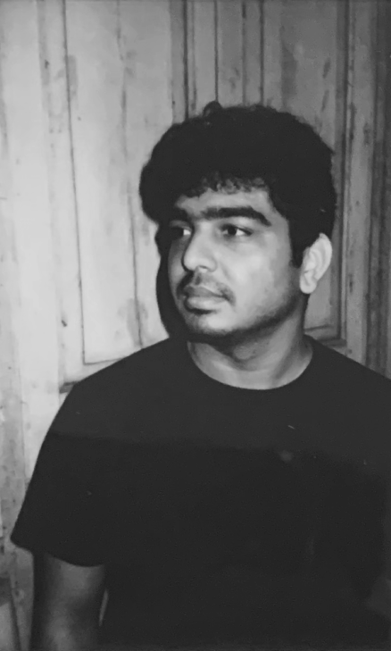
Manav Dhiman, founder of Man vs Type, crafts expressive and characterful letterforms that blend modern design with cultural elements, using inventive typography to transform brands' voices into compelling visual experiences.
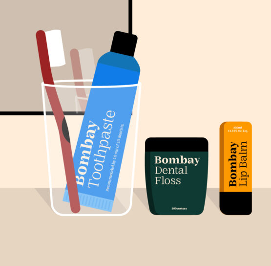
The letterforms in graphic and type designer Manav Dhimans’ works are highly expressive and full of character. Founder of an independent one-man design studio Man vs Type, the designer’s works centre around inventive typography, often reshaping and accentuating the structure of familiar letterforms. The use of space, curves, and proportions creates a visual rhythm and feel like they are part of a conversation between modern design and cultural elements. From a broader perspective, Manav’s works represent a refreshing departure from the act of ‘interaction and interpretation’ that has traditionally resided in physical mediums like canvases now adapting to contemporary digital environments. Some of Manav's personal explorations involve bold colours and their juxtaposition against contrasting backdrops, creating an engaging experience that encourages viewers to see type, often perceived as rigid, in a more playful and dynamic light. A graduate of the MIT Institute of Design, Manav currently employs typography as a key element at his studio, Man vs Type, translating various brands' strategies and voices into compelling visual designs. Some notable clients for which the designer has created custom types include Apple, Netflix, and VegNonVeg. The flair in Manav’s designs is rooted in the fact that he shares a deep relationship with the 'forms' present around him and his ability to see the extraordinary within the ‘mundane’. The inspiration can range from subjects as ordinary as a toothbrush to a concrete wall, glimpses of which are evident in several of his works. One such prominent example is Man vs Calcutta, in which the typeface draws inspiration from the engravings of one of the churches in the city. What began as a personal interest in sketching letters eventually snowballed into a project that captured the idiosyncrasies of different Indian cities. His approach of creating something innate also extends to other aspects of Manav's work, including logo, website, and identity design, where he has designed for diverse domains, from Architectural Digest's 2023 annual design show to My Real Trip. Manav’s works embody a clean aesthetic, yet what has truly captured the attention is his ability to infuse dynamism and impact in a way that enhances, rather than detracts from, the core elements of his designs.


Manav speaks to Blur The Border :
Blur : You What is the meaning behind your alias Man vs Type?
Manav : I wish I had a great story behind the name, however there is none! I needed a new account to post my type design work (separate from my personal Instagram account) and I just kind of workshopped this in a few minutes. I do remember being a little surprised that it was available, and I took it! Over time, the name has taken on a certain charm that it didn’t initially have.
Blur : Do you have a definitive process while creating? Are there any habits or rituals that help you get into a creative mindset?
Manav : Usually it starts from some type of type I spot in the wild and have this itch to draw it for myself. Once I start doing that, it takes on a life of its own and lets it guide me. So what I end up with in the end is extremely different from what I started with. I like the process of creating. As I’m designing something — whether it’s a short word, a singular letter, or a typeface — I make copies every step of the way as I try out different ideas. Every piece of type I make through those copies — from the very basic start with maybe a few rectangles to the final form.
Blur : What role does the environment play in your work or in fueling your creativity?
Manav : As I touched upon in the previous answer, the environment plays a big role. I might spot the LED type on a bus and want to create something like that, or maybe some stencil type on an electricity box. I really enjoy the process of just wanting to draw the things I see when I’m out and about. My immediate surroundings play a role too, I love looking after my 30+ plants, paying close attention to seeing what they need and enjoying seeing new leaves sprout. Observing them grow and paying attention to their needs gives me a sense of calm and a fresh perspective.
Blur : How has your artistic style evolved over the years, and how do you view this evolution?
Manav : When I started I really enjoyed the process of making type unreadable since that’s its primary function. So I would make whatever I want without really thinking about if anyone can read it or tell what it says. Is it a ‘g’ or something else? I have found that even if it's hard to read, if people are intrigued by it they will spend the time deciphering it and in turn that piece of design will stay with them for longer. As I have grown and the years have passed I do think that has shifted and become less of a focus. I do still enjoy drawing type that looks unusual, but I also enjoy the craft of drawing something that looks very beautiful. I enjoy the tiny subtleties of type more.
Blur : Is there any writer, artist, musician, or designer who you look up to or who has inspired your works?
Manav : When I was studying Graphic Design, I was drawn to postmodernism—not so much for its aesthetic but for its approach. The idea of creating something so unconventional that it demands attention intrigued me. It shifted the emphasis away from the final outcome and more toward the process of getting there. In a world where everyone is trying to find meaning or a profound concept for their piece of design and/or art, I find it exciting and incredibly freeing to make something just for the sake of making it without thinking too much about what it means. That doesn’t make it any less interesting or important either. I also love breaking the rules in design, and this mindset ties back to why I admire artists like Andy Warhol. He used to get his mother to write the copy on a piece of work he was creating in her own handwriting. I found that to be amusing and brilliant.
Blur : If you were to collaborate with other artists outside of your discipline, what is one collaboration you would love to do?
Manav : I’d love to bring my work into more tangible, physical spaces. The idea of printing one of my pieces at an enormous scale—something so impractical that no one could ever hang it in their home—excites me. I’m also fascinated by the idea of turning type into sculptures. Seeing type take on a three-dimensional form would be incredible, especially if it could interact with people in real space.
Blur : Which of the projects you've worked on do you love the most?
Manav : That’s almost impossible to answer! But if I think about which projects I’ve had the most fun with, it would be the work I create just for my Instagram. I enjoy making those pieces without any external pressures or expectations. There’s a sense of freedom in it, and I’d love to archive that work in some way someday.
Blur : What potential do you see for the evolution of contemporary Indian typography?
Manav : There is incredible potential for Indian typography. The sheer amount of languages and scripts we have requires a lot more typefaces drawn for them. Apart from typefaces, even custom typography for the growing landscape of Indian brands, TV shows and of course films have a huge amount of potential. The demand for unique, tailored typography to match the diversity and vibrancy of these industries is immense, and I think we’re just beginning to tap into that potential.